2023 January
2023 July
2024 January
10x
growth
700k
USD
70k
USD
0 USD
(free campaign)
Final Results
When we deliver the value users actually want, growth takes care of itself.
I shifted the UX from process-driven ("file faster") to value-driven ("understand and save on your taxes"),
so users saw real value instead of just a finished task. That reframe drove a 10× revenue increase in a year,
proof that when users see the value, growth follows.
Increased Conversion Rates
Paywall (Payment Rate)
between tax deduction users and non-users
Entry to Calculation Page
61.1% (2023 January) → 97% (2024 January)
Increased Activation Rate
13.9% (2023 January) → 19.5% (2024 January)
Increased User Satisfaction
72.2 →
Net Promoter Score (NPS)
Increased Acquisition per Tax Season
38,000 (‘23 January) → 216,000 (‘24 January)
Increased Returning Payers
21% (2023 January) → 31% (2024 January)
Retrospective
What This Project Taught Me

01
Small shifts in perspective can reshape the entire product when consistently executed.
One thing I learned from this project is how much impact a small reframing can have on both the product and team culture. At first, we approached the issue mostly as a friction problem and focused on improving visibility or conversion through UI optimization. But after stepping back, I realized the bigger issue was that the value of the service was buried and not clearly understood by users. That shift changed not only the design direction, but also how the team approached experimentation, communication, and problem solving overall. What made the reframing effective was consistently applying the same thinking across the product experience, messaging, and marketing direction.
02
Focusing on value first leads to more meaningful solutions.
It’s easy to jump into solution mode too quickly and focus on visible problems without understanding the underlying issue. When teams focus too much on short-term conversion improvements, there’s a risk of creating patch solutions that improve metrics temporarily without solving the real pain point. Through this project, I learned to spend more effort understanding the value users were actually looking for before thinking about what feature to build. That shift changed the kinds of questions I asked during problem solving. Instead of immediately manipulating UI to increase conversion, my first instinct became understanding the user’s actual pain point and whether it was something we could meaningfully solve.
03
Experimentation became a tool for validating value, not just optimizing UI.
Before this project, I mostly saw experimentation as an optimization tool focused on visibility improvements like placement, contrast, or more attention-grabbing wording. But during this project, I started using A/B testing differently, not just to optimize UI, but to validate whether users actually understood the value of the service. Instead of asking “How can we make users notice this more?”, I started asking “Why aren’t users interested in entering in the first place?” That shift helped uncover that the issue was not simply visibility, but whether users clearly understood the value they would get from the experience.

Project
Overview
After we launched the VAT filing service (0→1), the team made it free to drive acquisition. Sign-ups grew 136%, but activation stayed flat at ~14%. I stepped back and spotted the real gap: it wasn't usability. We had been building a "faster filing tool," but users actually needed a service that helped them understand and save on their taxes.
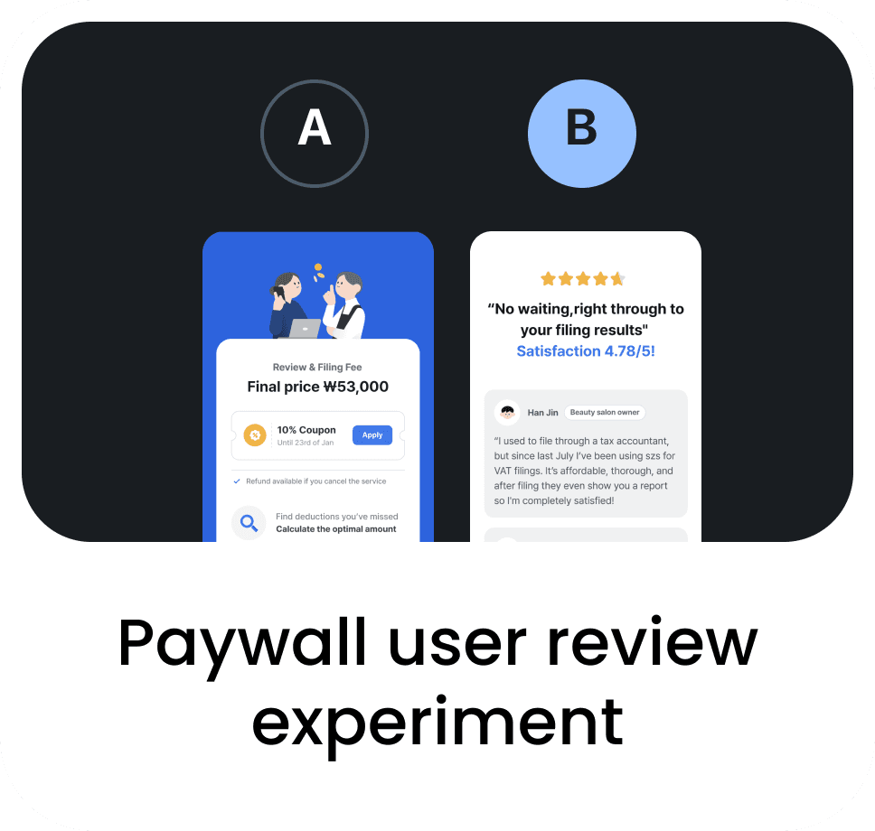
As the sole designer, I reframed the challenge from cutting friction to making value clear and trustworthy. I led a redesign that surfaced potential tax savings upfront and showed users how their results were calculated, building confidence. To learn what actually motivates users, I set up a rapid experimentation framework and ran 8 A/B tests in a two-week tax season. The result: a 10× revenue jump from $70K to $700K, a 22% lift in payment conversion, and noticeably stronger user trust.
Role
Sole product designer
Led UX strategy and rapid experimentation that drove 10× revenue growth in one year
Team
Product Managers
2
Tax Planners
2
Marketer
2
Front-end Developers
2
Back-end developers
2
CS manager
1
Timeline
2023 January - 2024 January (1 year)
Key Skills Applied
UX Strategy &
Problem Framing
Found that low activation came from missing perceived value, not usability, and reframed the problem around trust and visible benefits
Rapid Experimentation & Growth Strategy
Built and led a rapid experimentation framework, running 8 A/B tests in a 2-week tax season to find the key drivers of motivation and conversion
Value-Driven UX Design
Redesigned the experience to show value upfront and explain results, so users see what they gain and feel confident finishing
Impact
10X Revenue Growth
70k → 700k USD
Revenue growth after the redesign
Higher Payment Conversion
+22%
Paywall lift from
the tax-deduction feature
Increased User Satisfaction
72.2 → 75
Net Promoter Score (NPS)
Project
Overview
After we launched the VAT filing service (0→1), the team made it free to drive acquisition. Sign-ups grew 136%, but activation stayed flat at ~14%. I stepped back and spotted the real gap: it wasn't usability. We had been building a "faster filing tool," but users actually needed a service that helped them understand and save on their taxes.
As the sole designer, I reframed the challenge from cutting friction to making value clear and trustworthy. I led a redesign that surfaced potential tax savings upfront and showed users how their results were calculated, building confidence. To learn what actually motivates users, I set up a rapid experimentation framework and ran 8 A/B tests in a two-week tax season. The result: a 10× revenue jump from $70K to $700K, a 22% lift in payment conversion, and noticeably stronger user trust.
Role
Sole product designer
Led UX strategy and rapid experimentation that drove 10× revenue growth in one year
Team
Product Managers
2
Tax Planners
2
Marketer
2
Front-end Developers
2
Back-end developers
2
CS manager
1
Timeline
2023 January - 2024 January (1 year)
Key Skills Applied
UX Strategy &
Problem Framing
Found that low activation came from missing perceived value, not usability, and reframed the problem around trust and visible benefits
Rapid Experimentation & Growth Strategy
Built and led a rapid experimentation framework, running 8 A/B tests in a 2-week tax season to find the key drivers of motivation and conversion
Value-Driven UX Design
Redesigned the experience to show value upfront and explain results, so users see what they gain and feel confident finishing
Impact
10X Revenue Growth
70k → 700k USD
Revenue growth after the redesign
Higher Payment Conversion
+22%
Paywall lift from
the tax-deduction feature
Increased User Satisfaction
72.2 → 75
Net Promoter Score (NPS)
Background
After launch, the business decided to make the service free for the next tax season to drive acquisition. But even with free pricing and high sign-ups, the number of users actually filing stayed flat.
38,000 ppl
2023 January
89,000 ppl
2023 July
Acquisition
+136%
13.9%
2023 January
14.1%
2023 July
Activation
+0.2%
But,
I used 5 Whys to find the root cause of UX problems.
The team's instinct was to fix each issue on its own. But all three pointed to one shared cause. I ran a 5 Whys analysis, tracing the quantitative and qualitative findings down to a single root cause.
What Happened
Activation remained flat (+0~0.2%) despite free pricing and 136% increase in acquisition.
03
Why?
They didn't see how it actually
benefited them
VOC : Users didn’t notice how it saves taxes
04
Why?
The interface showed the simple process,
not the reward
VOC : Users weren't sure whether they did it right
05
Why? - Root Cause
We delivered functional value (easy filing), but users wanted emotional and financial value (confidence and savings)
02
Why?
Their motivation was extrinsic (it's free),
not value-driven
VOC : Users used it mainly because it’s free
01
Why?
Users didn’t feel motivated to complete filing
High drop-off in key screens
80% of users from related services didn't engage
I realized the UX problems were just symptoms, and the real challenge was finding the root cause beneath them.
01
Design Direction
Build trust and confidence through guidance
Help users understand how their tax is calculated, not just how to finish fast
Solution 01
Redesigned the walkthrough to
explain each step and build
confidence in the results
02
Design Direction
Make Benefits Tangible
Add features that show users how to reduce or deduct their VAT
Solution 02
An automated tax-deduction feature that shows exactly how much users save before they pay
03
Design Direction
Validate perceived value fast
Use rapid experiments to test what users value and keep optimizing for activation
Solution 03
A rapid testing framework to find which value signals drive activation within the 2-week tax season
I used the insight to reframe the team's mission:
we weren't building a faster filing tool, we were building a service that helped users
understand and save on their taxes. The shift gave us three clear design directions,
each targeting a different side of perceived value.
to Value Driven UX
The Reframe : From Functional UX
Design Direction
Analysis
To understand why activation stayed flat, I paired behavioral data with user feedback to uncover the real problem.
To see why strong acquisition wasn't turning into activation, I paired behavioral data (quantitative)
with user feedback (qualitative) to find the gap between what users did and how they felt.
UX Problem 01
Trust issues
Users doubted whether their calculated results were accurate
UX Problem 02
Unclear value proposition
Users came because it was free, not because they saw real value
UX Problem 03
Weak perceived benefit
Users wanted tax-saving insights, but the service never surfaced that value
Quantitative findings
What happened? · Key behavioral patterns

01
High drop-off on key funnel screens

02
Fewer landing-page clicks (lower engagement)

03
Low reactivation from existing SMB users of a similar service
Qualitative findings
Why it happened? · Key user insights
Direct evidence
13.7%
stopped due to inaccuracies in the calculated tax
15.4%
weren't sure
they filed correctly
User 1
I was worried the estimated tax amount might be wrong
User 2
It’s not accurate. The refund amount is different
3.4%
weren't sure
the process had finished
User 4
I’m not sure if I did it correctly
User 5
I wasn’t even sure if it was finished
Circumstantial evidence
57%
used it simply
because it was free
User 3
The best part was that it didn’t cost anything
User 2
I tried it because it was free, but I’m not sure I’ll use it again
33%
of non-users stuck with their old way
User 4
I’m used to filing on Hometax, so I didn’t feel the need to switch
User 3
Using a new service looked more troublesome
Circumstantial evidence
26.5%
wanted tax-saving info but weren't satisfied
User 1
I wish it showed me how to save on taxes or get deductions
User 2
I want to instantly see how much I’m saving through this
Solution
01
Redesigned the walkthrough experience
Strategic Intent
Reframed the walkthrough from a quick calculation into a guided experience that helps users understand and trust the results.
01
I started with why the design failed: it rushed users to a result they couldn't understand.
Hypotheses
If we guide users through each step with clear explanations before showing the final result, they’ll trust the calculation and feel confident finishing.

1
UX Problem
VAT result appears too abruptly, so users struggle to trust the calculation result.
Potential Solution
Show results after users review how the tax is calculated, helping them see the logic behind the outcome.
Value
Build trust through transparency
2
UX Problem
No clear explanation of what the numbers mean.
Potential Solution
Add plain-language guidance for each calculation step.
Value
Add clarity through context
3
UX Problem
Long, dense screens reduce focus and engagement.
Potential Solution
Split long screens into shorter steps that keep users engaged and assured.
Value
Build confidence through guidance
02
I explored 4 directions to make
guidance feel trustworthy.
I picked the conversational walkthrough (Option A). It balanced clarity, reassurance, and flow, but more importantly it felt personal, which fit our hypothesis best: users trust what they can understand and feel guided through.

Our Pick!
Description
Step-by-step guide with an AI persona that explains the numbers
Each field gets a short explanation
Adds a progress tracker as users move through the flow
Before the result, shows short illustrated steps of how tax is calculated
UX Principle
Conversational trust, since people trust what feels personal and guided
Progressive disclosure,
since showing everything at once overwhelms
Goal-Gradient Effect,
since visible progress motivates completion
Cognitive mapping,
since understanding the process builds confidence
Rationale & Evaluation
Builds empathy and feels guided, like talking to an expert
Can slow down experienced users who want speed
Low cognitive load, with context right next to each input
Feels too technical and lacks emotional reassurance
Motivates completion and lowers perceived effort
Helps momentum, but not trust or comprehension
Improves conceptual understanding
Adds extra steps that may feel like friction
Direction 01
Conversational Walkthrough
Direction 02
Inline Contextual Hints Design
Direction 03
Visual Progress
Direction 04
Sequence Hints
Final Design
A walkthrough that explains the numbers, so trust builds with each step.
Key Result 01
Significant
conversion lift.
61.1% → 97%
The largest conversion lift by single design change and adopted as an internal design benchmark.
Key Result 02
User feels more confident.
"I finally understood the calculation"
"The step-by-step explanation made me feel confident in the result"
"I used to double-check everything on Hometax…(now I don't need to)"
Hypotheses
If users can clearly see how much they save and
the process feels effortless and trustworthy through automation, they’ll see the service as rewarding,
reliable, and worth paying for.
Design Direction
A flow that calculates potential deductions
and shows the exact savings
before payment
Value
Make financial value visible before payment
User Pain 01
Users wanted savings info. The product never showed it.
26.5%
wanted tax-saving info but not really satisfied with the current version
"I wish it showed me how to save on taxes or get deductions…"
"I want to instantly see how much I’m saving through this"
Design Direction
Guided review that finds eligible deductions for them, reducing the process to a simple confirmation
Value
Reduced mental load to focus more on rewards
User Pain 02
Users wanted to save money but the process made them give up halfway.
Up to
47.9%
of total VOC data reported difficulty in either manual input or tax deduction process.
"I didn’t know if I did it right."
"Too many steps so I just gave up halfway…"
01
All pain points led to the same need:
users wanted to save real money, not just time.
Key Results
Results confirmed the hypothesis: users are more willing to
pay for the service when they see how much tax they can save.
Key Result 01
More users
converted at the paywall.
Payment rate rose 22% after we surfaced tax-saving value before payment (validated by A/B test)
Key Result 02
New revenue.
USD
Key Result 03
Average money
saved per user.
USD
Solution
02
Saving users real money,
not just time: designing
the tax deduction feature
Strategic Intent
Shift the value proposition from "we file for you" to "we save you money," and prove it with real numbers before asking for payment.

1
Hook users before the details
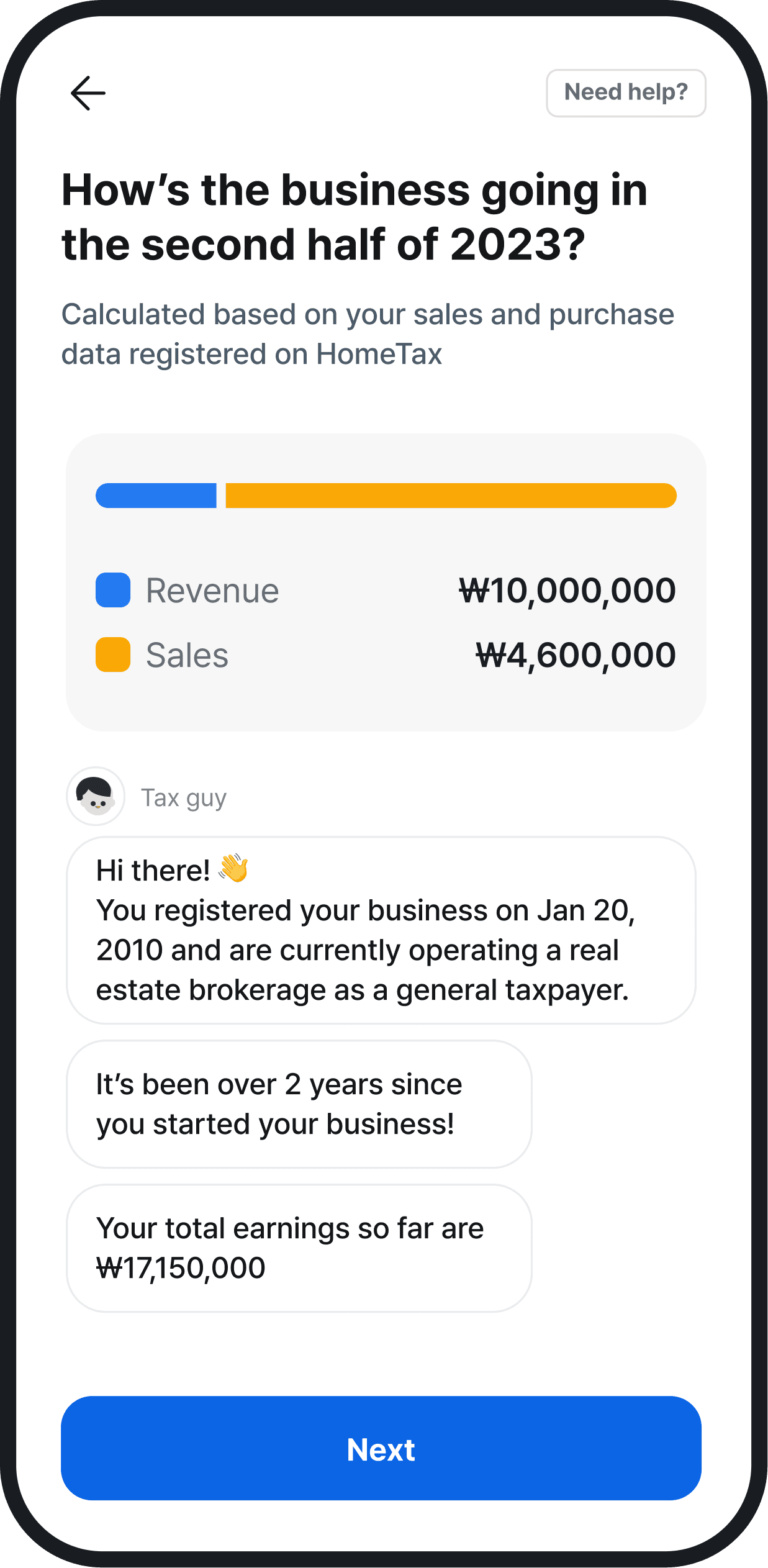
Users see the deduction opportunity before the detailed calculation, hooking them with what they can save before they dig into the numbers.
2
Quiz-style eligibility check to reduce drop-offs
We need the business type before calculating deductions. Instead of a form, I built a card-based yes/no flow that takes seconds, turning a likely drop-off point into an effortless step.
4
The final impression: reward, not completion
I designed the final screen to show exactly how much users saved through deductions. The last thing they see before paying shouldn't be a finish line, it should be a reward.
Solution
Smart Tax Deduction Feature
Sales details page

Automation is fast, but blind automation erodes trust.
So I added a review step where users see exactly what was found and can adjust it. That gives them ownership of the outcome, and room to fix anything the system gets wrong.
3
Build trust through transparency and control
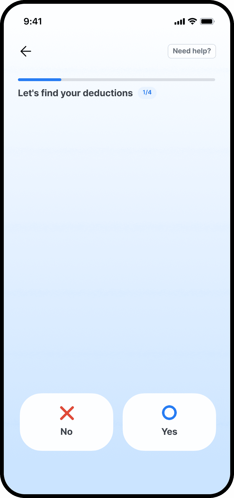

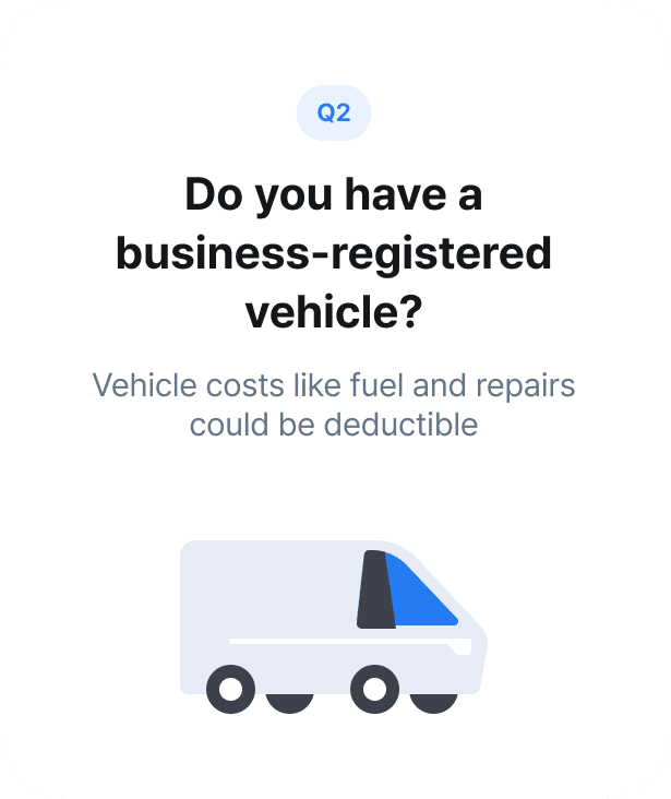


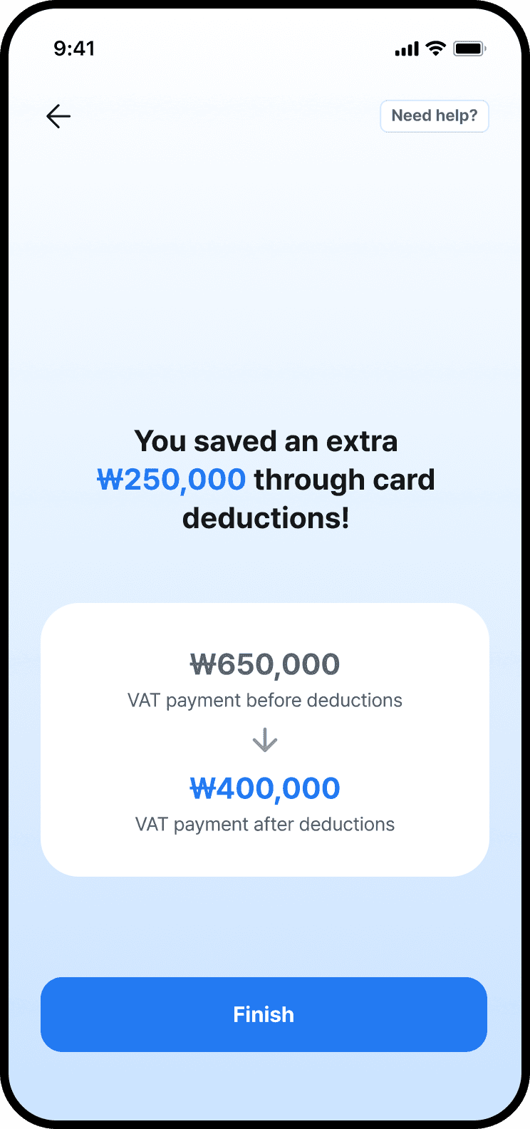
After collecting data on user pain points and unmet needs, I didn't jump straight to solutions. I first asked: what value are users actually seeking? The answer shaped the features I built.
Old testing model
When expected conversion rate is not achieved
Identify causes from multiple data perspectives
DA
PM
PD
Conduct ideation sessions
PM
PD
FE
Create and discuss design concepts
PM
PD
FE
Handoff to FE and start development
PD
Set up and run experiments
PD
FE
Result analysis
DA
PM
PD
New testing model
Conduct early ideation, hypothesis building, and design work ahead of major tax or filing seasons
PM
PD
FE
When expected conversion rate is not achieved
Handoff to FE and start development, some have been developed
PD
Run experiments
PD
FE
Result analysis
DA
PM
PD
January 13th
January 14th
January 15th
January 16th
January 17th
January 18th
January 19th


Statistically Significant


Insignificant

Statistically Significant

Statistically Significant
Insignificant

Insignificant
Statistically Significant
Statistically Significant
Solution
I built a rapid testing framework that lets us prepare experiments before the season starts and iterate almost in real time once it opens, compressing weeks of learning into days.
Problem 01
We could only test with
real users during tax season and no other validation
window existed
Problem 02
Each season is only 2 weeks,
so every day without a live experiment is a
day of learning lost
Problem 03
Every test carries real stakes: a bad variant doesn't just dent a metric, it damages trust in a service people use once a year
Challenge
How might we test multiple hypotheses within a week
without sacrificing design quality or measurement accuracy?

Rapid testing is an internal tool, but its real purpose is to confirm and deliver what users truly value in days, not months.
Solution
03
Building a rapid A/B testing framework to validate value faster
Strategic Intent
The redesign needed proof, and we had exactly 2 weeks to get it. So I built a testing framework to compress months of learning into days.
We had a limited testing window each year, which made learning slow.
Old model: react when conversion drops.
New model: ready before it does.
The new rapid testing model shortens the workflow by preparing design variations in advance, so we can act immediately if conversion rates fall below expectations
Setup
Waited until drop-offs occurred, then ideated reactively
A/B test setup time
2–3 days
Max experiments per week
2–3
Collaboration
Sequential between PM-PD-FE (waterfall)
Setup
Pre-built test variants & hypotheses before season starts
A/B test setup time
< 1 day
Max experiments per week
8-10
Collaboration
Parallelized early with PM, PD, FE co-ownership
The fallback plan: when conversion drops below target.
If conversion underperforms, the framework guides fast hypothesis testing and UX adjustments
Result
I ran 8 A/B tests in a single week during tax season using the new framework.
Key Results
The framework let us find what users valued faster.
And every funnel improved because of it.
Key Result 01
Average conversion rate increases on each funnel.
Key Result 02
Increased
experiment velocity.
2 →
tests/week
Due to confidentiality, detailed A/B testing results owned by Jobis & Villains Co. cannot be disclosed
From 1 → 100
From 1 → 100
How reframing the product's value
turned flat activation into 10X growth
How reframing perceived
product value turned low activation into 10X growth


The Challenge
After making the service free, sign-ups jumped 136% but activation stayed flat at ~14%. Free pricing brought users in, but something stopped them from finishing.
The Strategy
I ran a 5 Whys analysis combining behavioral data with user feedback, and traced every drop-off back to a single root cause: we delivered functional value (easy filing), but users wanted emotional and financial value (confidence and savings). They saw a "tax filing tool," not "a way to save money."
So I reframed the mission: we weren't building a faster filing tool but we were building a service that helped users understand and save on their taxes. This shift defined three design directions: build trust through guidance, make benefits tangible, and validate perceived value rapidly.
Redesigned the walkthrough experience
Solution 01
I reframed the walkthrough from a quick calculation flow into a guided experience that helps users trust the result.
After exploring 4 directions, I chose a conversational walkthrough an AI-persona guide that explains each calculation step in plain language before showing the final number. Users trust what they can understand.
Results
Entry-to-calculation conversion jumped from 61.1% to 97% and became the largest single-design lift in the product.
Make Benefits Tangible:
Designing the Tax Deduction Feature
Solution 02
I designed an automated deduction flow that surfaces savings before the paywall, shifting the value proposition from "we file for you" to "we save you money."
The flow hooks users with savings upfront, replaces a drop-off-prone form with a card-based yes/no quiz, and ends on a reward screen showing exactly how much they saved. I added a transparent review step so users could adjust the automated results and keeping ownership in their hands.
Results
Increase of 22% in payment conversion, validated via A/B test.

Validate Perceived Value Faster with a Rapid A/B Testing Framework
Solution 03
I built a testing framework to compress months of learning into the 2-week tax season. I shifted the workflow from reactive (wait for drop-offs, then ideate) to proactive by pre-building variants and hypotheses before the season starts, with PM, PD, and FE working in parallel instead of sequential handoffs.
Results
A/B test setup time dropped from 2–3 days to under 1 day, and we ran 8 A/B tests in a single week of tax season.
Before
Setup
Waited until drop-offs occurred, then ideated reactively
A/B test setup time
2–3 days
Max experiments per week
2–3
Collaboration
Sequential between PM-PD-FE (waterfall)
After
Setup
Pre-built test variants & hypotheses before season starts
A/B test setup time
< 1 day
Max experiments per week
8-10
Collaboration
Parallelized early with PM, PD, FE
For the full process,
please view on desktop.